Last year we saw a massive rise in webinars, online quizzes, classes and courses, and many in-house presentations that would normally be done face-to-face.
It’s almost impossible to monitor your audience now. Are they even listening? Are they carrying on with their own thing in the background? Who knows? So one of the main objectives, when you are presenting, is to get the viewers’ attention early, and even more importantly, you want to keep it!
The key pointer I can give you is to make sure your presentation is consistent throughout. Obviously, your tone and pace are very important, along with a few other elements, but I’m going to delve into the visual side of your presentation.
Here are 7 tips to help you keep your presentations and webinars on (power)point.
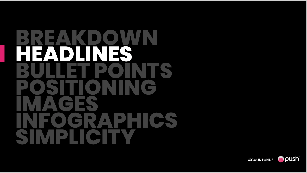
1. Breakdown
Include a breakdown of what you’re going to cover in your presentation in an index slide. This provides an overview of the topics and subtopics you’ll be covering. It will also help give the viewer/listener upfront assurance to stay with you throughout the presentation.

2. Headings/Subheadings
The main headings will have been introduced in the agenda/index, but you’ll want to keep the titles as short as possible… a heading is not a heading if it’s a paragraph!
I’ve discovered that having a slide especially for the main heading makes it easier for viewers to follow and helps distinguish between all sections. The above is an example of a main heading divider, while keeping the rest of the topics visible for viewers to see what’s been covered and what is still to come.
You can also have subdividing slides for subtopics, but make it look different from the main header slide. This is where you can add a splash of creativity (but keeping with a theme)!

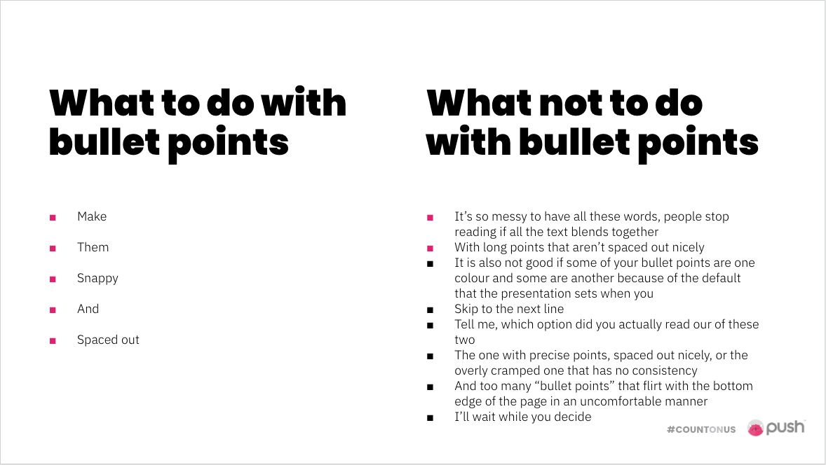
3. Bullet Points
First of all, make sure your bullet points are consistent. If you have round bullet points on one slide, don’t try to “shake it up” with square bullets on the next slide.
Remember: not too many, and not too long. It’s a bullet point, not a bullet paragraph.
The example below shows the difference between a simple set of bullet points and an overly busy, haphazard set of points. And trust me when I tell you I’ve seen option two more times than I would like to say.
Another point to rule the points is that if you have a colour breakdown per topic section, make sure your bullet point colour matches the section colour.
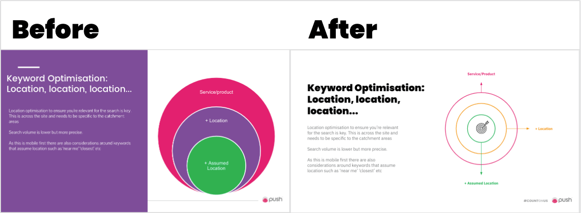
5. Positioning
You might not personally notice if the text in your presentation is too close to the edge, but I bet someone viewing it does, and it will hurt them mentally… take it from someone who has been mentally tortured looking at some presentations. Don’t hurt people. It’s not nice. There are rulers and guides that you can use to make sure things stay lined up and within margins.

I hope that the above example proves my point for me, but if not, let me break it down a little bit:
It looks unprofessional
It does not align with branding
It does not align with other text on the page
It is TOO LONG to be a heading
The rest of your presentation could look great – the bullet points could be perfectly spaced and the subheading slide could look mint, but if the positions aren’t right through the rest of it, what’s the point?
5. High-Quality Images
I feel that it goes without saying, but any images in your presentation need to be of good quality and high resolution! While Shutterstock is preferable, not everyone has access to it, so when you do your image search on Google, please please please go to Tools, click the Size dropdown and select large, and be careful not to use photos with watermarks on them.
Also, if you want to resize the image once it’s in the presentation, make sure it scales proportionally and doesn’t stretch or squash the image.

6. Infographics
Infographics help viewers see a visual representation of the information you’re verbally giving them. Unfortunately, though, they can be hard to keep in line with your brand. A good place to start is to keep infographics in your company’s colours, but that doesn’t mean they need to be heavy. Keep them neat and the line weight should be the same for all infographics if you’re using outlines for anything.
7. Keep it simple
To end off, just keep it as simple as possible. You should speak more than you present. You can expand verbally on whatever is on the screen, but if it is all written out for them, they will most likely read instead of listen.
Short headlines, summarised bullet points, clean infographics, good to go.